
2024 PAINT COLOUR TRENDS AND TIPS
As the new year begins to steam ahead, we are forecasting some of the latest paint colour trends to share with you for the upcoming year! In the following guide, we’ll go over what’s exciting right now in the colour world and some of our classic go-to hues and paint selection tips.

Benjamin Moore Colours:
OC-17 – White Dove: A clean, classic warm white with a modern flair.
OC-75 – Pristine: Dusty rose undertones define this delicate off-white.
1560 – Antique Pewter: Bringing back memories of antiquity with this subtle green with grey undertones
2136-20 – Regent Green: A dark, rich, moody green perfect for making a statement.

Benjamin Moore Colours:
OC-18 – Dove Wing: This warm off-white is commonly found in our residential projects for its luminous quality with silvery undertones
OC-65 – Chantilly Lace: This is our go-to wall or trim selection. This neutral white complements most colour palettes.
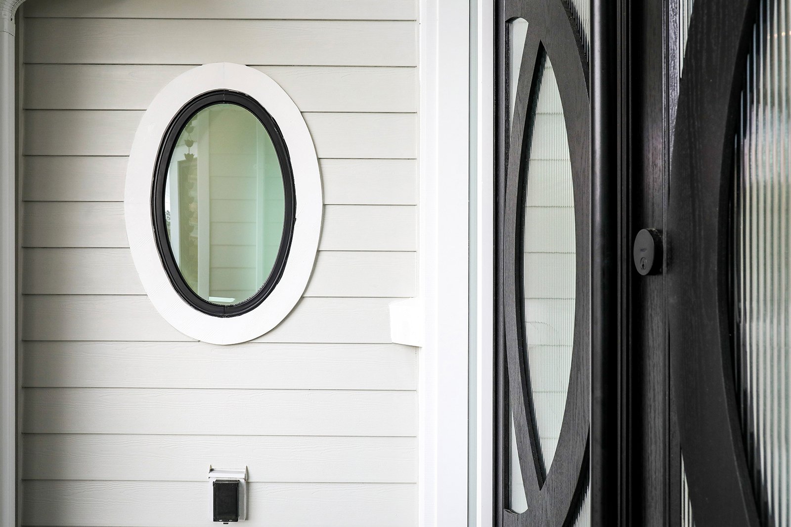
2134-30 – Iron Mountain: This “use anywhere” shade of soft black is a great complementary choice for exterior colour palettes
CSP-620 – Wild Blue Yonder: This powdery blue serves as a lovely accent colour within a variety of styles and design schemes.
Paint Selection Tips:
Walls – We can’t say this enough, always sample your colour selection in person before committing to painting larger surface areas in your home. Natural light conditions, window placement and choice of lighting fixtures can all affect your colour choices. Sample cans are often inexpensive and can save you the cost of re-doing a paint job you are not in love with.
Recommended Sheen: Eggshell. For vertical surfaces, we recommend going with a happy medium eggshell sheen. Overly glossy paint sheens tend to expose and reflect any imperfections of your walls, whereas a flat matte finish is trickier to clean and maintain.
Trim – When selecting a trim colour, you’re looking for a hue with similar undertones to your main wall colour, such as warm with warm or cool with cool undertones. Selecting paint colours with similar undertones keeps a room from looking disjointed or colours becoming muddy.
Varying trim colours with cohesive undertones helps tie a colour palette together.
Recommended Sheen: Semi-Gloss. This sheen gives door and window casings and baseboards a subtle contrast and is also easier to clean which comes in handy in high-traffic areas with finger and toe prints.
Ceilings – We recommend using a half-tint of the same colour you are using for your trim surfaces to maintain visual consistency in your home.

A flat paint sheen for ceiling planes helps reduce shadows and glare caused by surrounding light sources.
Recommended Sheen: Flat. For the overhead surfaces in your home, we recommend going with the lowest sheen you can find such as a flat or matte paint finish. This helps reduce glare and shadows cast by light fixtures and any natural imperfections in your ceiling’s surface.
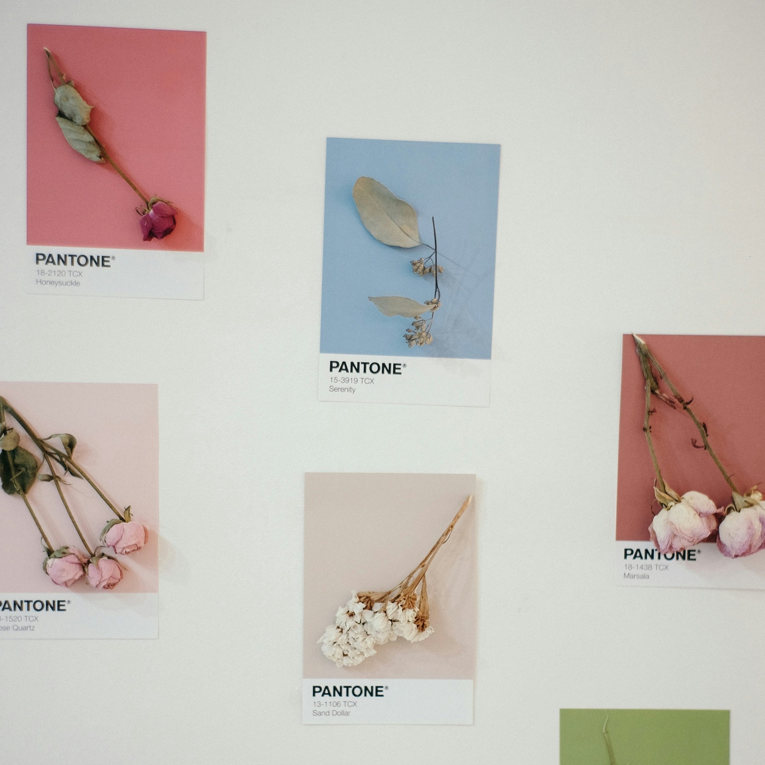
Finally, one of the best start-off points for selecting paint colours for your home is to find an object which inspires you visually such as a piece of artwork, clothing or accent pillow and begin to draw your colours from there. This way, you can incorporate what you already love into your design and ensure a holistic look and feel throughout your home. Happy Painting!

Colourful artworks or objects already found in your home can provide the start-off point for finding the right colour palette for your home.